
Although I could not resist this title (the wonderful alliteration) this is really a contribution to this week’s photo challenge: My favourite horizons can be found be the sea, or at least close to water. Therefore they are occasionally upside down.

tobias m. schiel
Although I could not resist this title (the wonderful alliteration) this is really a contribution to this week’s photo challenge: My favourite horizons can be found be the sea, or at least close to water. Therefore they are occasionally upside down.

Great horizon images!
Thanks, Amy!
Beautiful pairing, Tobias. Color and the sea and reflections.
Thank you, Lynn!
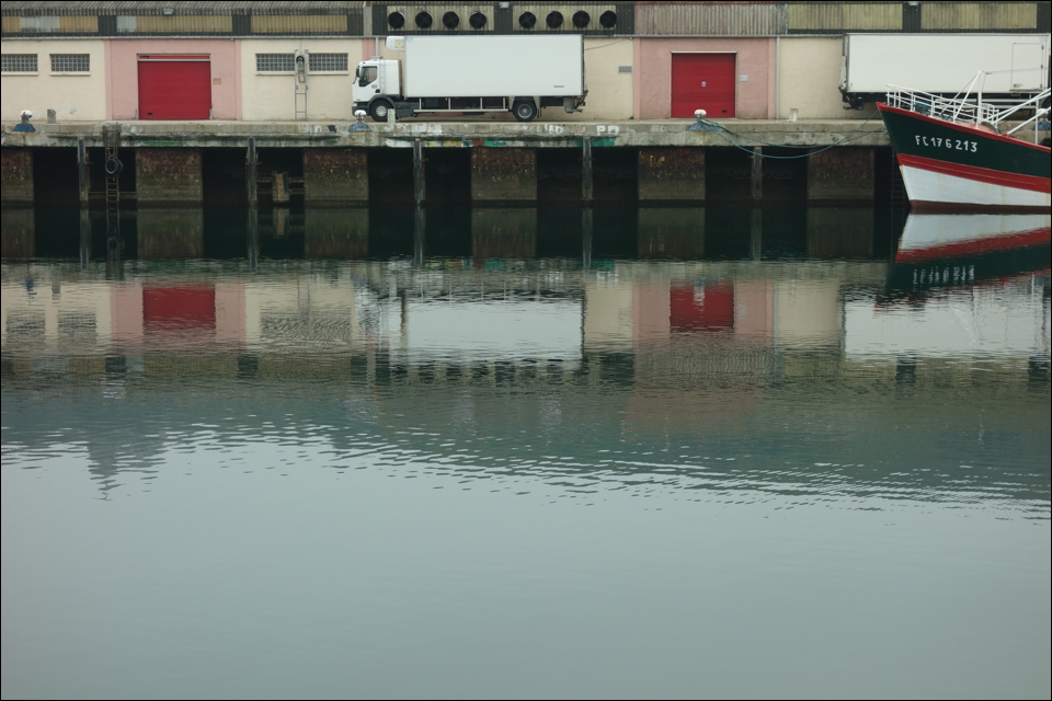
The 2nd shot is very beautiful. I remember your interest in abstract. This shot is quite perfect half abstract – half realistic. The colors are in harmony. There is rhythm of the architecture; but there is a stronger rhythm of red and white rectangles; and broad black stripes on the quay. The reflection doubles the rhythm and makes it even stronger because it looks less realistic. When I look at the white truck and the boat, I see the real world; but when I see the rhythm of the red; white; and black rectangles, I see an abstract composition of rectangles. The grey reflex of the sky carries the whole scene and makes it stronger as a contrasting, rhythmless surface. What I mean is: great shot!
Harrie, what can I say? Thank you so much for this in-depth, eye-opening review!
Like them both. 🙂 I love reflections.
janet
Reflections are fascinating for me too. Thank you, Janet!
Very creative! Nice to see you playing!
Oh yes! I just feel like playing right now. With colours, preferably.
Thank you for your very nice comment, Kathryn!
You are quite welcome. I love your B&W’s but it’s nice to see the less serious side too !