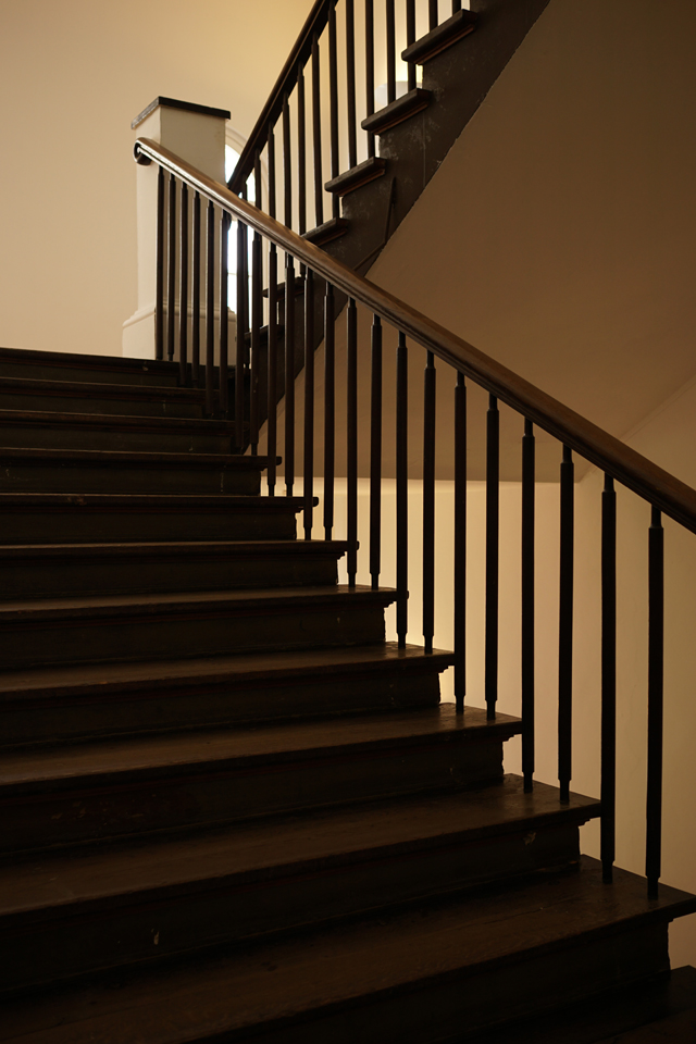

Hamburg, MKG, 12. April 2016 | These pictures are exclusively intended as a contribution for Paleica’s Magic Motto: Licht & Schatten (Light and Shadow).

tobias m. schiel
Hamburg, MKG, 12. April 2016 | These pictures are exclusively intended as a contribution for Paleica’s Magic Motto: Licht & Schatten (Light and Shadow).
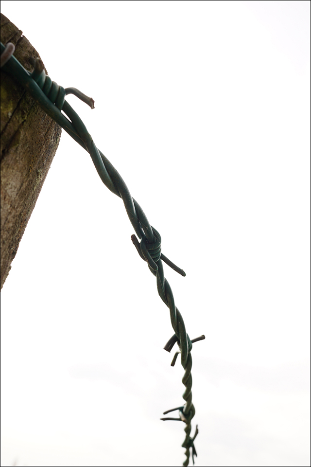

After some very friendly nudging by Paula I decided I had to come up with something for her Thursday’s Special: Forbidding. At first, things did not quite work out the way I intended them to, so it took a little while. Despite the obvious choice in the left picture I think these finally work.

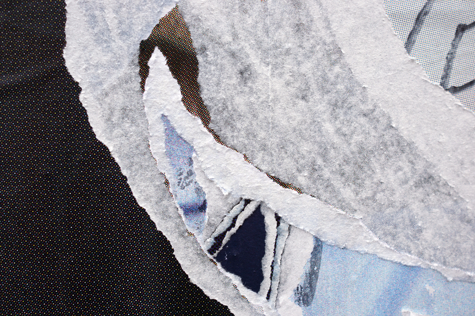
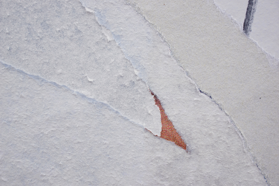
This series keeps growing. New ads invite new graffiti, Bible quotes written by a man who claims to be Jesus, which in turn get ripped off by somebody else, creating layers of narrative potential… To collect the resulting compositions, I have added a new gallery called “Litfaß” (after the inventor of this type of advertising column) to the Photo Series menu.
 This the fifth and last post in which I share pictures inspired by Paleica’s Magic Mottos. Formen und Figuren were in focus (no translation needed here, I think). Paleica mentioned geometrical forms among other things, which triggered it for me: I hope my contributions show that once you found a good topic, the pictures seem to multiply on their own account: You only have to know what you are looking for.


“Let’s not forget: even when used for ideas of great seriousness, photography is a beautiful playground.” Katherine Oktober Matthews, Chief Editor of GUP
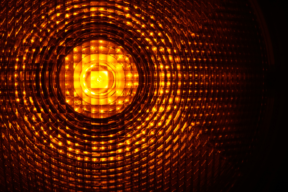
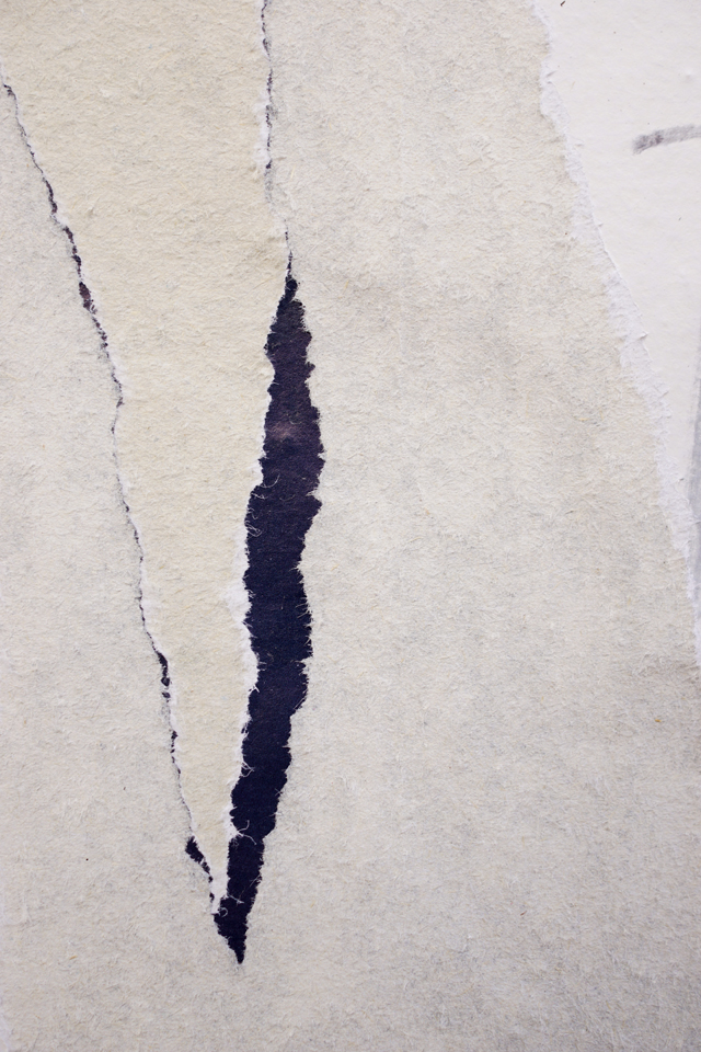
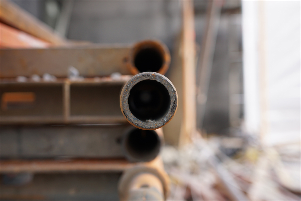
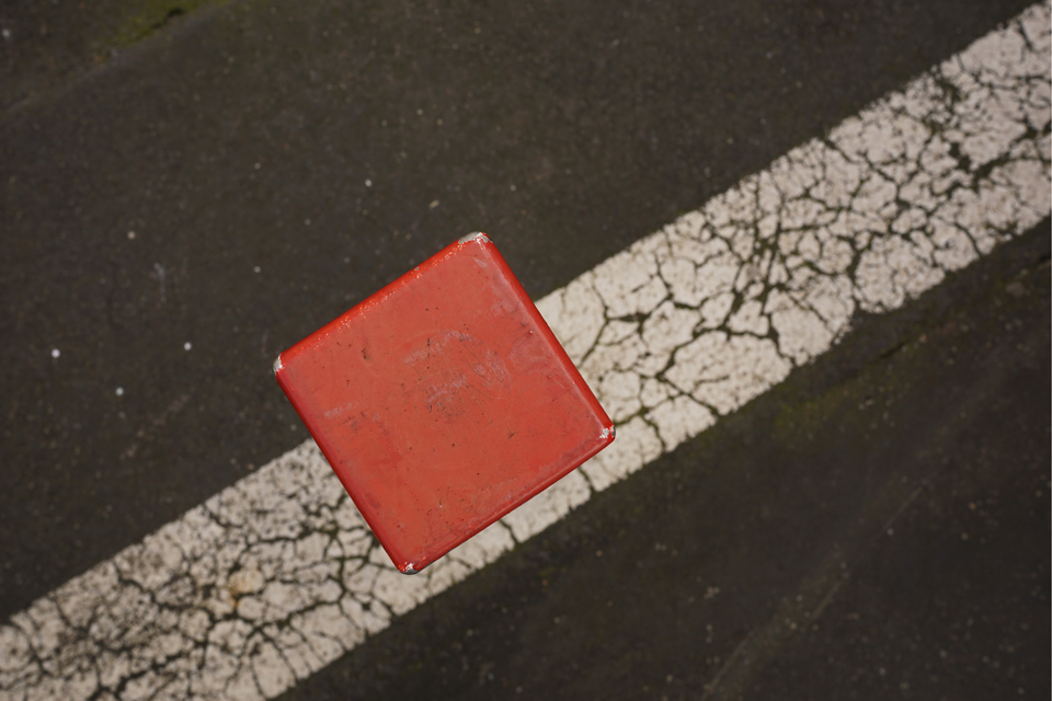
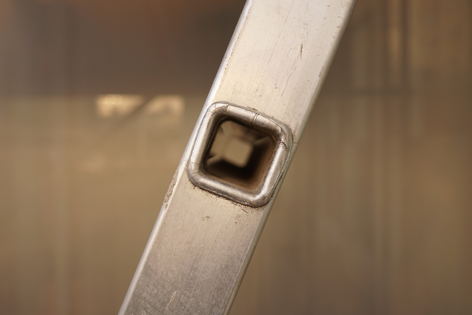
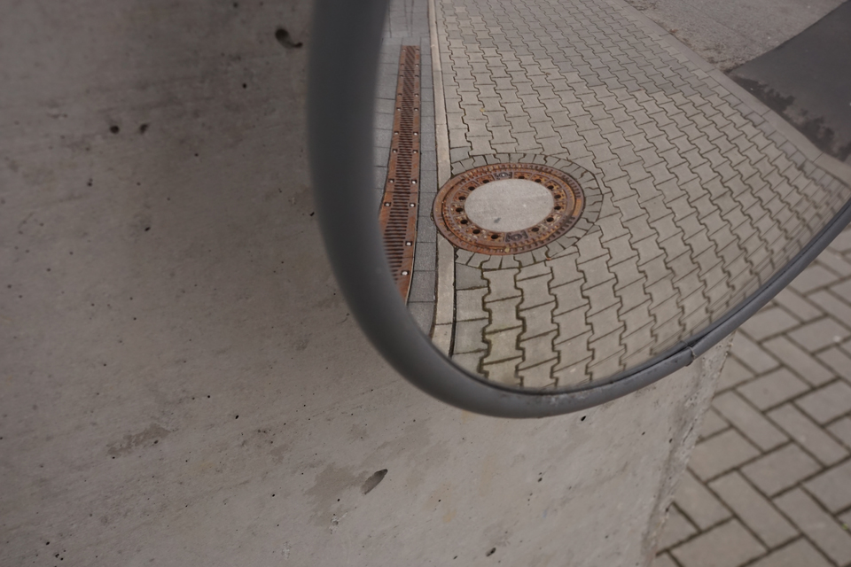
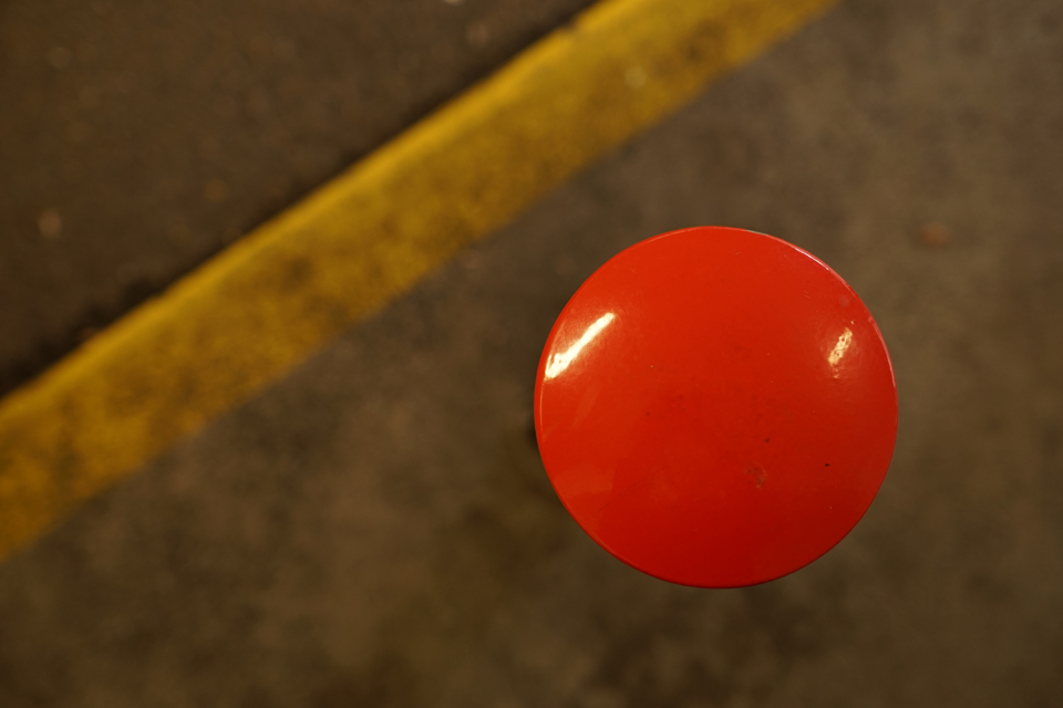
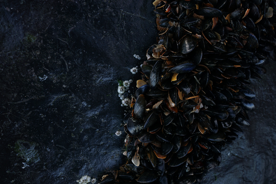
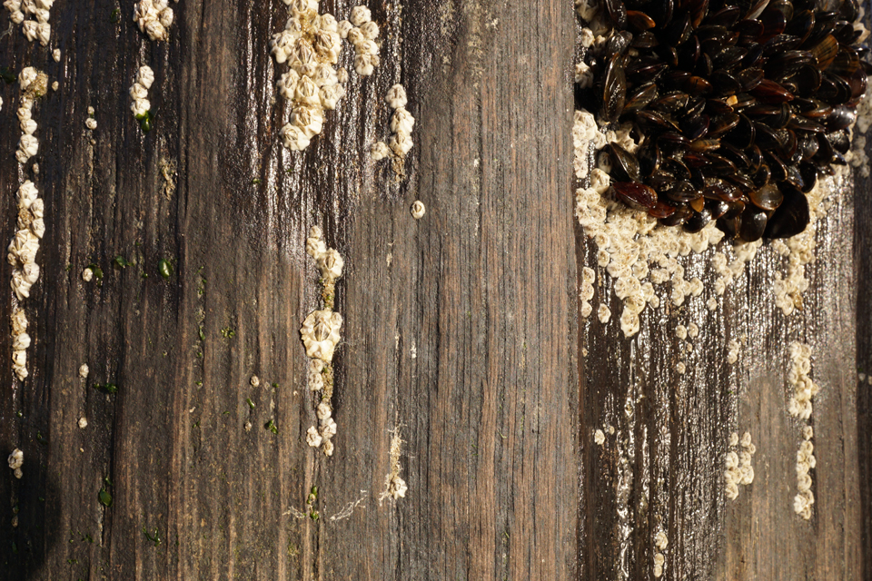
Following Paelica’s Magic Motto Formen & Figuren (shapes & figures), I decided to find as many dots and circles as I can. This is part four of the series.
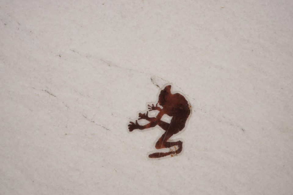
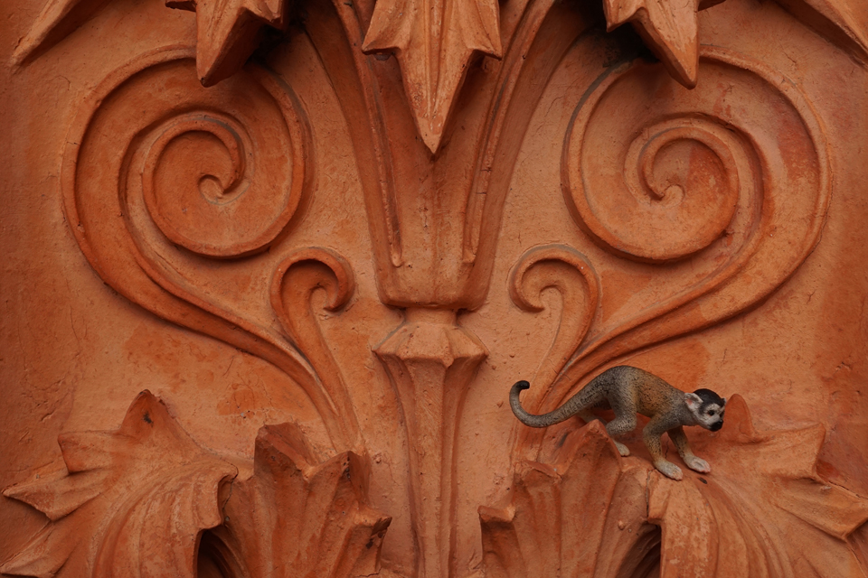
…or maybe it’s the God of Small Things. However, I did notintend to participate in Paula’s Thursday Challenge until I found this little devil, a very minuscule example of Urban Art.
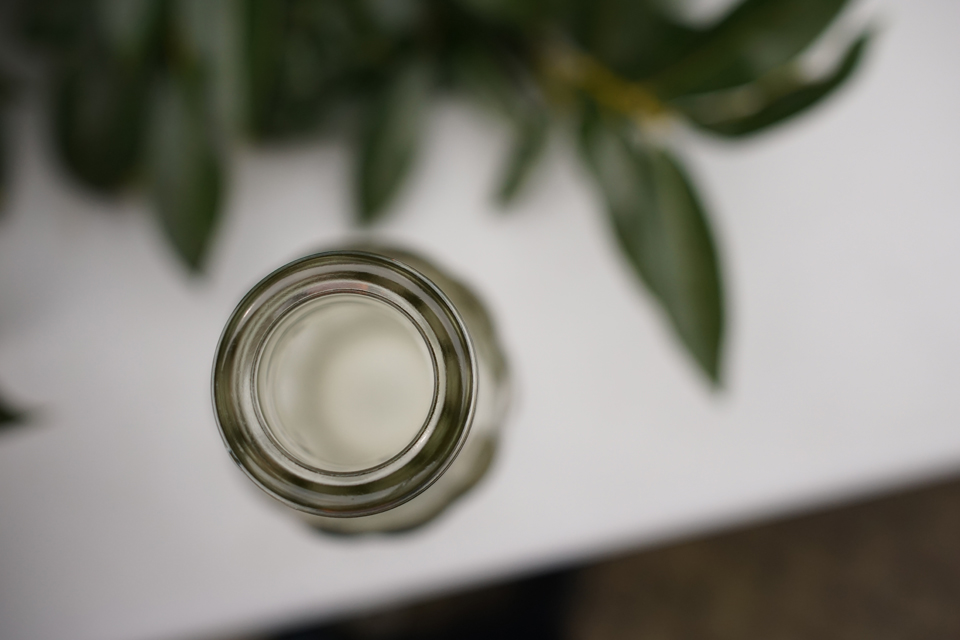 The second of my entries for Paleica’s Magic Motto for the month of March: Formen & Figuren: It seems like I got stuck with dots and circles, although there must be other forms, even in geometry. Call it creative stubbornness (I read that term in a mystery novel, and liked it).
 An entry for the Weekly Photo Challenge. For more experimenting and toying around with small animals in a life size world, see here.


Paleica at episoden.film gives photographers a month to come up with responses to her challenges, which is nice to begin with. In January and February I used the time to photograph and select, and came up with a retrospective by the end of the month. Today I see it differently. I photographed Formen & Figuren (shapes and figures), trying things out. I intend to share them over the month so we can see what develops (if anything develops at all).


This is an entry for Paula’s Thursday’s Special. All traces were found in southern France (Languedoc). Check out the other contributors’ pictures as well if you like.
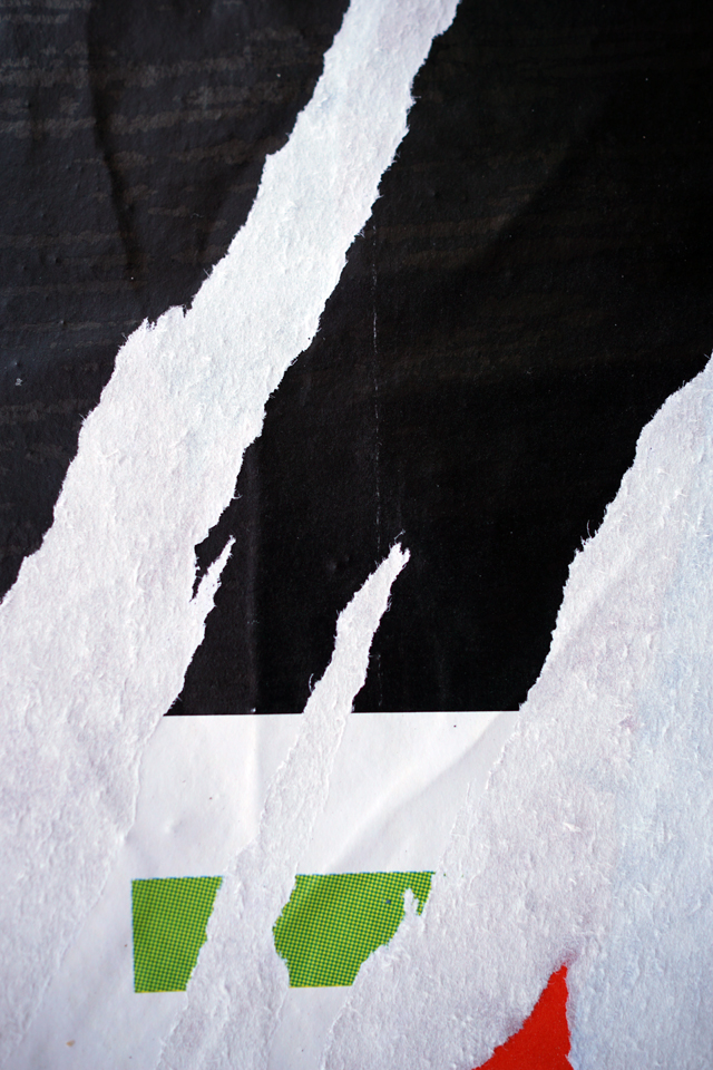
Last Thursday we invited friends and colleagues for a private viewing. The show included two pieces from the Litfaß series, and one of the visitors remarked that she had mistaken the two photos for collages at first sight.
Collage is a matter of choice: You pick the elements of your picture from a vast pile of available stuff, then arrange it into a composition.
The process of making a photo is very close to that of making a collage. You choose. You eliminate. The choice determines the outcome. We don’t show what is but what we see fit for framing.
I hope nobody minds me choosing another Litfaß picture (from session no. 17) over showing arrays of things to pick from for Paula’s Thursday Special which is – you may have guessed – choice. And this is what I chose from (click to enlarge):


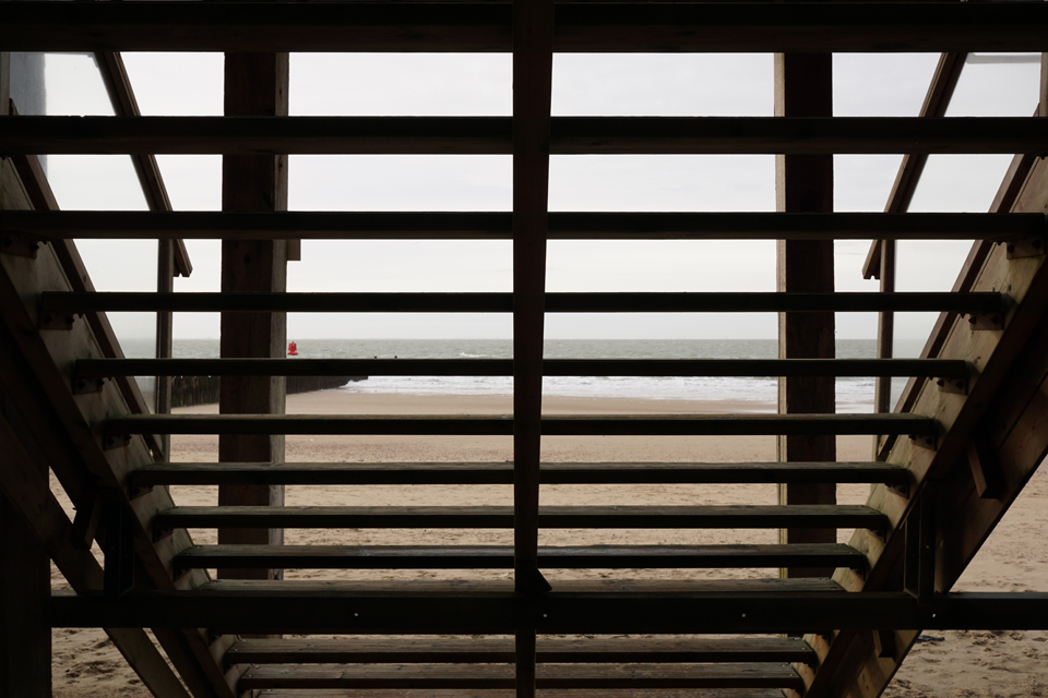
Same scene, different pictures, and I do not know which one I prefer. So I decided to show them both, trying to prove the point that – as has been noted – that it is the difference that makes the difference: Both appeal to me, but for different reasons.
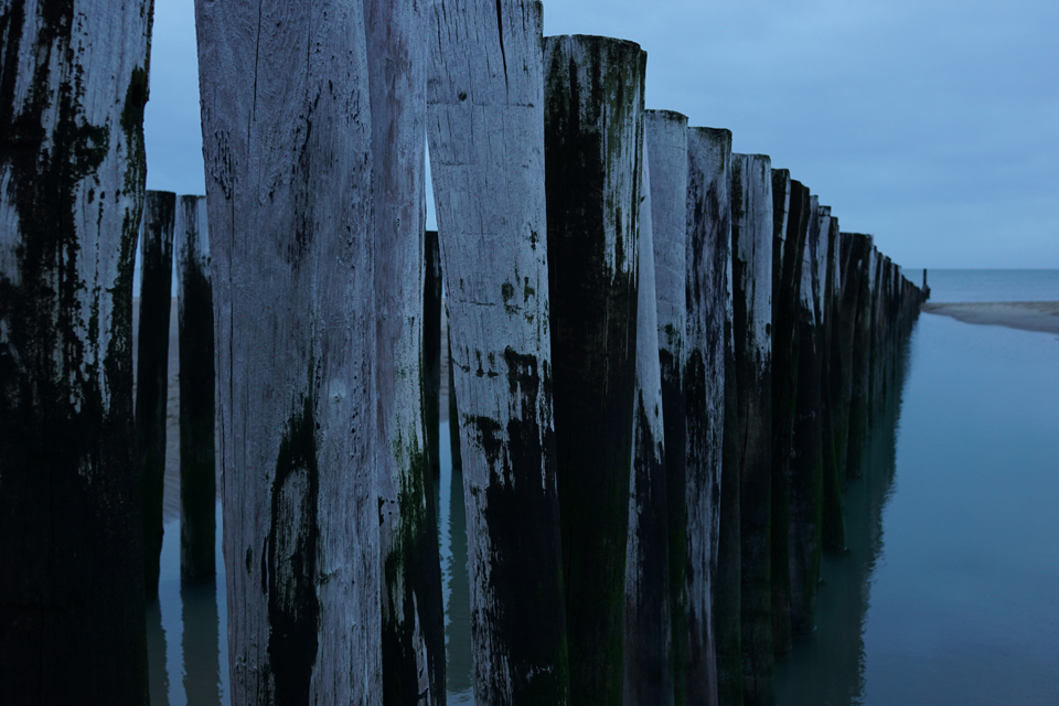
I looked at the original picture (bottom) and asked myself if it would look more ‘radical’ if I cropped the black parts to the left and right, letting the ocean view running past the margins of the picture. Now that seems to make the picture more difficult. There seems to be some hint that the world continues beyond the frame of the picture, and in some way the picture seems to correspond with its surroundings – the white background of the page – more openly.
In comparison, the original picture might be more conventional. The bright parts can be seen as a picture within the picture, and it is almost neatly framed – almost: The left part of the frame shows a post, its shapes are just visible. And the left side of the frame is also a bit “heavier” than its counterpart. It seems like this picture offers more information it is possibly more restful, suggesting that what we see is a whole complete in itself. It might be more affirmative.
Writing this, I realize there is a bias – but I really wanted to say that these are not just two more or less identical pictures of a piece of ocean, seen through some posts, but that form makes quite a difference, not necessarily between ‘good’ and ‘bad’ one, but in content.

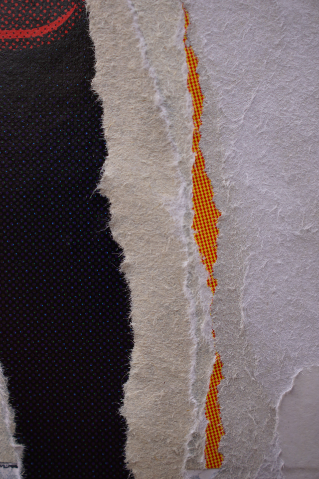
Life imitates art imitates life… If we only see what we know the impact of art seems clear: It hints at seeing differently, or different things. A torn-off advertisement poster may ‘contain’ an abstract composition. This one vaguely reminds me of Joan Miró. | This is my contribution for the Weekly Photo Challenge.
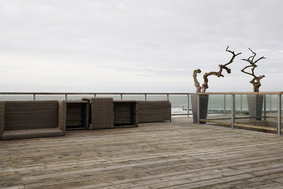


Near Westkapelle, Walcheren, January 2016.