Photographing Graffiti: trying to turn pictures into pictures. The walls of Blankenese Lighthouse (Hamburg) were covered with layers of graffiti (‘gone over’). Framing parts of them into new pictures seemed to make sense … trying to bring to light whatever meaning the details might contain. [Jen, thanks for the Weekly Photo Challenge.]
Tag: Pictures]
Look Up
Opposites
My contribution for the Weekly Photo Challenge…
Here and There
Paula would like to see Here and There wich immediately made me think of these pictures. I am trying to figure out the role photographs play in urban environments. Do we still notice them? Shouldn’t their realism, presenting ‘other space’ in urban settings, irritate? Maybe this only becomes visible once you photograph the photographs…
Litfaß 18/19
Litfaß 16
Formen & Figuren
This the fifth and last post in which I share pictures inspired by Paleica’s Magic Mottos. Formen und Figuren were in focus (no translation needed here, I think). Paleica mentioned geometrical forms among other things, which triggered it for me: I hope my contributions show that once you found a good topic, the pictures seem to multiply on their own account: You only have to know what you are looking for.
Das Eckige im Runden
Devil’s in the Detail
…or maybe it’s the God of Small Things. However, I did notintend to participate in Paula’s Thursday Challenge until I found this little devil, a very minuscule example of Urban Art.
Let’s Make Harmony
An entry for the Weekly Photo Challenge. For more experimenting and toying around with small animals in a life size world, see here.
Dot City
Paleica at episoden.film gives photographers a month to come up with responses to her challenges, which is nice to begin with. In January and February I used the time to photograph and select, and came up with a retrospective by the end of the month. Today I see it differently. I photographed Formen & Figuren (shapes and figures), trying things out. I intend to share them over the month so we can see what develops (if anything develops at all).
Late Afternoon by the Sea
Renesse Underground
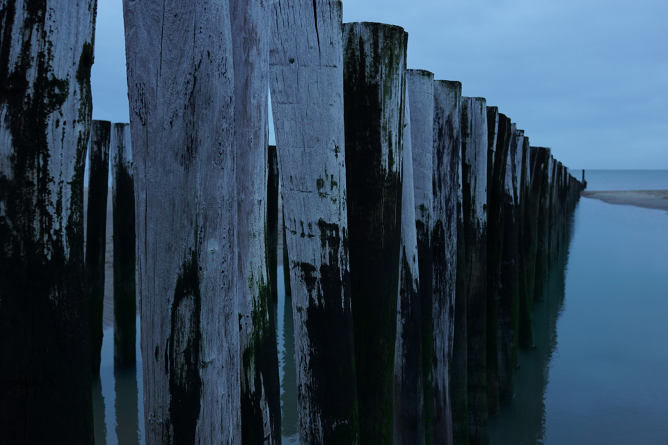
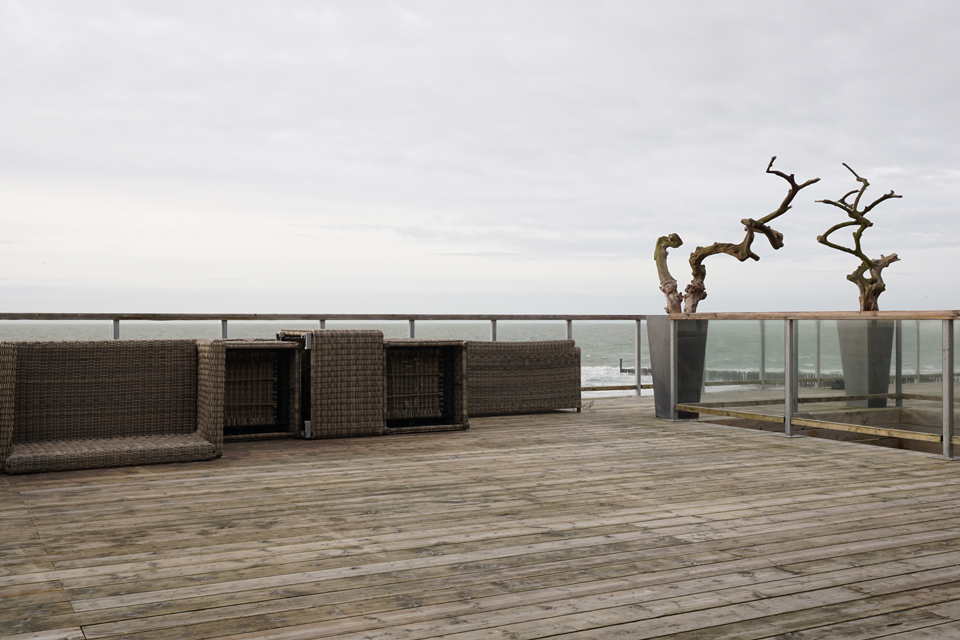
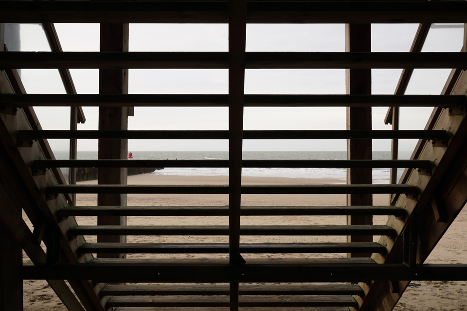
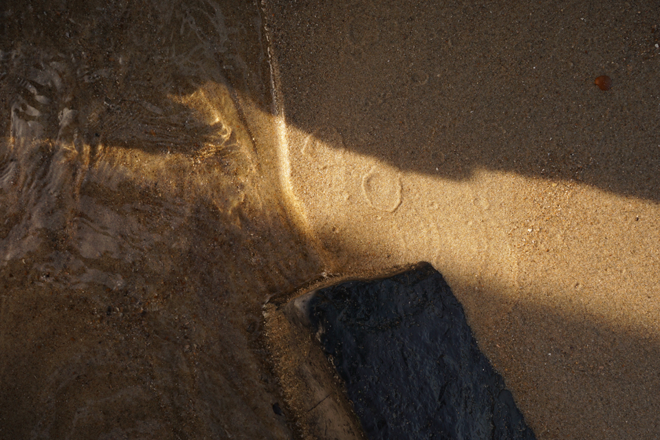
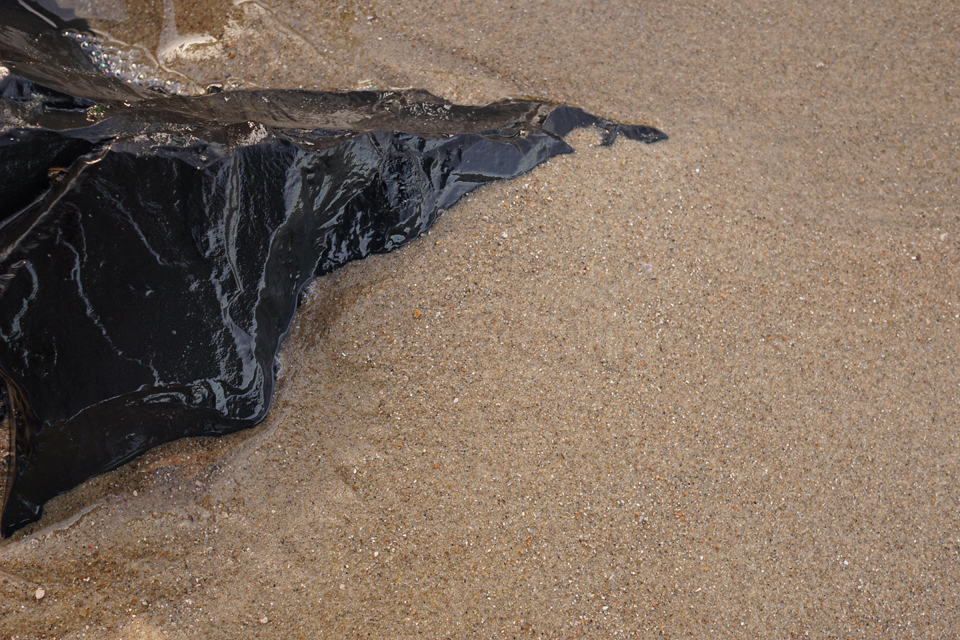
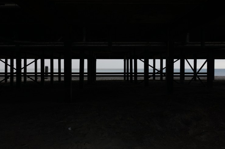
Same scene, different pictures, and I do not know which one I prefer. So I decided to show them both, trying to prove the point that – as has been noted – that it is the difference that makes the difference: Both appeal to me, but for different reasons.
I looked at the original picture (bottom) and asked myself if it would look more ‘radical’ if I cropped the black parts to the left and right, letting the ocean view running past the margins of the picture. Now that seems to make the picture more difficult. There seems to be some hint that the world continues beyond the frame of the picture, and in some way the picture seems to correspond with its surroundings – the white background of the page – more openly.
In comparison, the original picture might be more conventional. The bright parts can be seen as a picture within the picture, and it is almost neatly framed – almost: The left part of the frame shows a post, its shapes are just visible. And the left side of the frame is also a bit “heavier” than its counterpart. It seems like this picture offers more information it is possibly more restful, suggesting that what we see is a whole complete in itself. It might be more affirmative.
Writing this, I realize there is a bias – but I really wanted to say that these are not just two more or less identical pictures of a piece of ocean, seen through some posts, but that form makes quite a difference, not necessarily between ‘good’ and ‘bad’ one, but in content.
Beachclub Zuiderduin
Life-Size
A contribution for Paula’s Thursday Special: Life-Size. At first I did not know what this was all about. But then our pets got out of hand – that cat: You don’t pay attention for a moment and the next thing you know, she’s in the milk! Just sharing some photos of the weird menagerie. Life-size, of course.
Walk on Beach
Walking on beaches is a passion I seem to share with Jo. Which is why I would like to share this walk (or maybe even series of walks) on her Monday Walks collection: Walking the beaches of south Holland, you find many things – among them the strandpaviljoens, beach cafés standing on stilts at the seaward base of the dunes, a welcome refuge from rain and cold and in case of an appetite for fish & chips. As a landscape photographer, I have always hated them because they are prone to get in the way. But this winter, I decided to turn the tables: You’ll see a couple of strandpaviljoen pictures this month.
Vibrant
An entry for the Daily Post’s Weekly Photo Challenge.
A, Registered
Paleica just started a photo challenge involving twelve magic mottos for this year. This month’s theme is Schilder und Schriften (signs and fonts). Since the season is still dark, I decided to look for letters that glow.
Hello … My Name is … YOR7
Looking for traces of use and abuse around Wiesbaden’s former courthouse, I spotted these pictures painted on metal doors. I found them absolutely gripping, and immediately decided I had to show them to Jörg from Dosenkunst. Then I checked with his blog and found out he had photographed and posted them quite a while ago. So what was the point of photographing them again?
I told my wife I had to show her some photos of graffiti, and upon seeing them she replied: “Are you sure you want to call these graffiti? They are art!” So here’s another interpretation of art…
Uzès
Uzès is a town in the south of France, and it is definitely worth a walk (or two). So what could be more appropriate than entering this post as a contribution for Jo’s Monday Walk? Jo collects walks from all around the world. I also enjoy her project because walking and photography are a perfect match … ain’t they?


