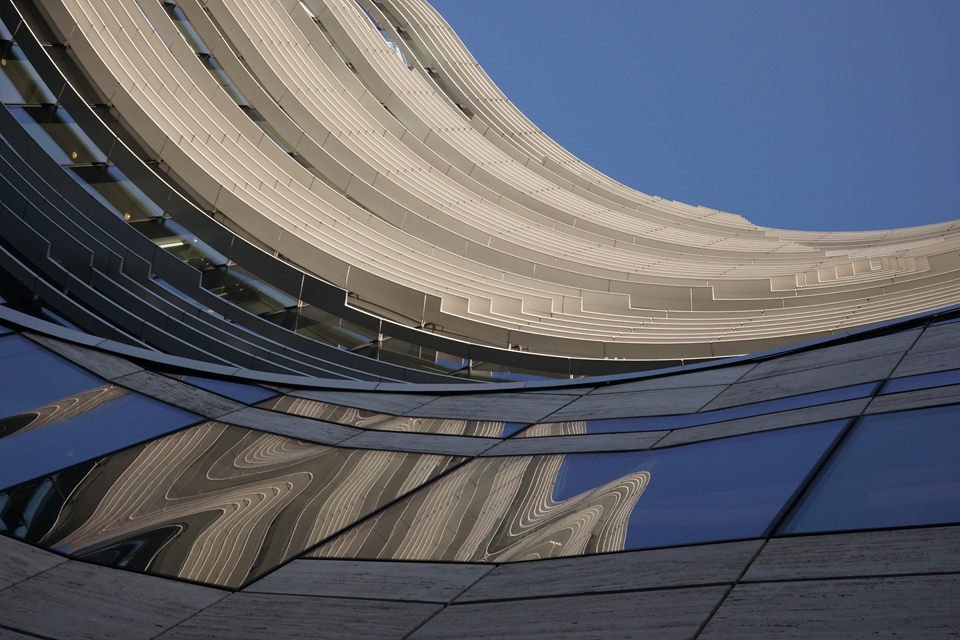
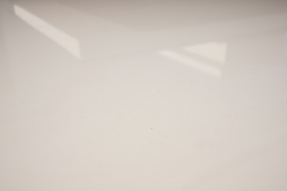
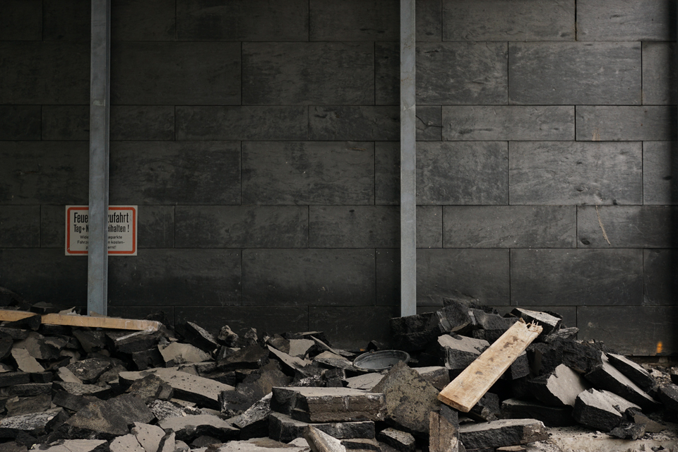
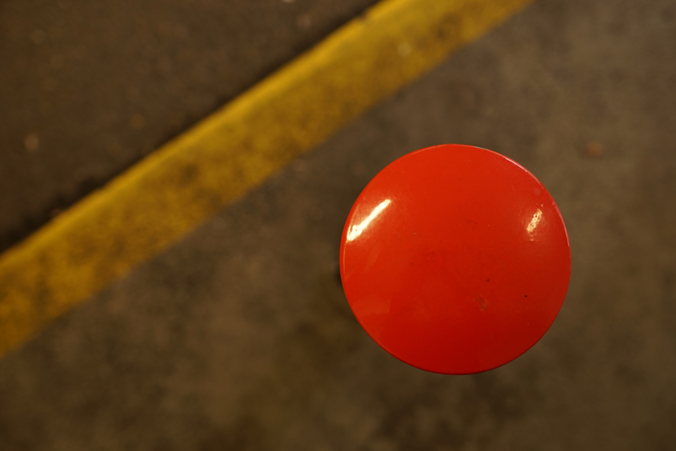
“Has something bright or reflective caught your eye in the moment?” – Here’s my answer for the Weekly Photo Challenge: It just happened yesterday.
tobias m. schiel
“Has something bright or reflective caught your eye in the moment?” – Here’s my answer for the Weekly Photo Challenge: It just happened yesterday.
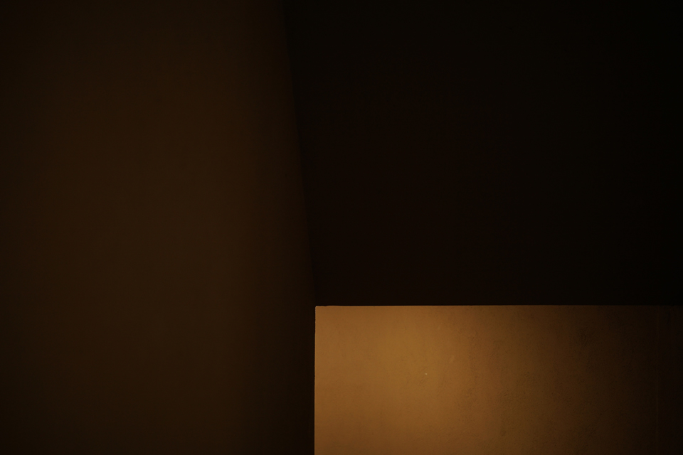
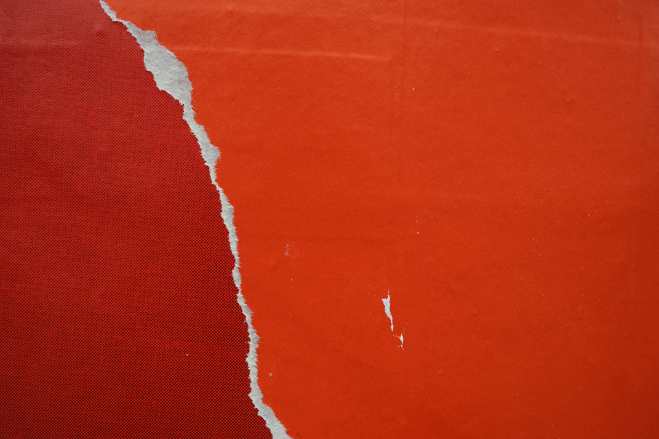
Following up on the idea that minimal photography might mainly be ‘about’ light.
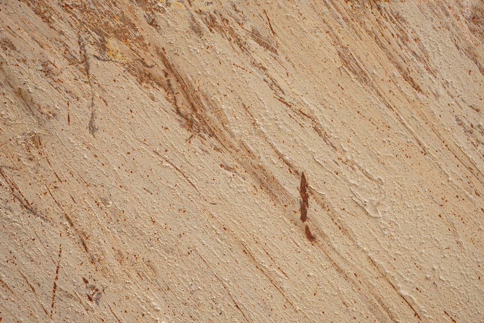
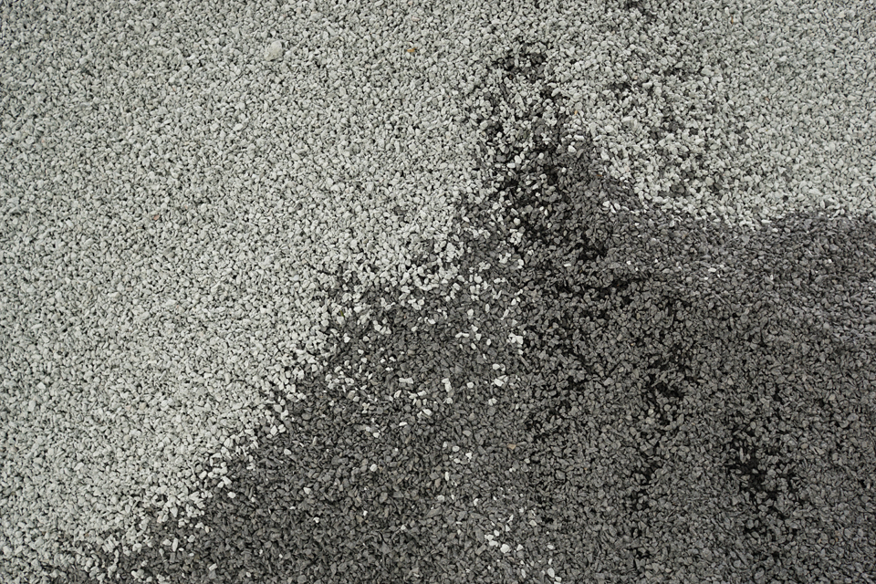
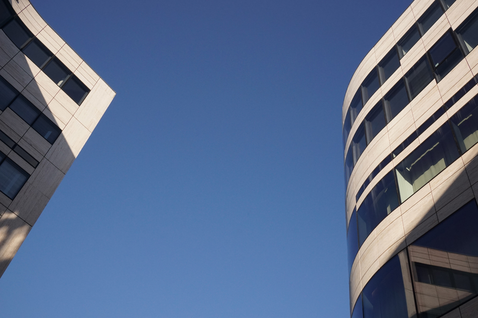
Magical Minimalism is this month’s theme at Paleica’s. When I described my understanding of Minimalism before, I said that minimal music can be quite hypnotic. So adding ‘magical’ is right to the point here. I also wondered if part of the effect of minimalism might be caused by the notion of not really being too sure of what you hear… Well maybe this also works with these pictures, in a visual way, in a way.
In her monthly photo challenge, Paleica suggests we show some Magical Minimalism. Setting aside the magic, what’s minimalism? People knowing my pictures may be surprised I ask this – but I am not a Minimalist. It is true that I often make use of a somewhat minimalistic approach to show what I have in mind: Minimalism always was a means for me, not an end…
I enjoy listening to minimal music, so let me focus on that. It can be highly hypnotic, and some of my favourite pieces – like Louis Andriessen’s Hoketus – make you wonder what you really hear. Hoketus is played by two small groups of musicians. Both groups play highly repetitive patterns – there are not even really melodies during the first few minutes. But as you keep listening to both ‘sides’, melodies seem to evolve.
It takes all the concentration you can muster to actually hear what the respective groups of play… I think Hoketus points to the basic elements of music such as pitch, timbre, and rhythm.
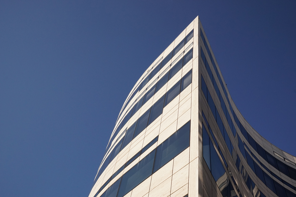
Without having done any reading on the topic, I would like to try and induce what Minimalism for the sake of Minimalism might be: A specific attempt to highlight (and question) the material or elements used in the art work.
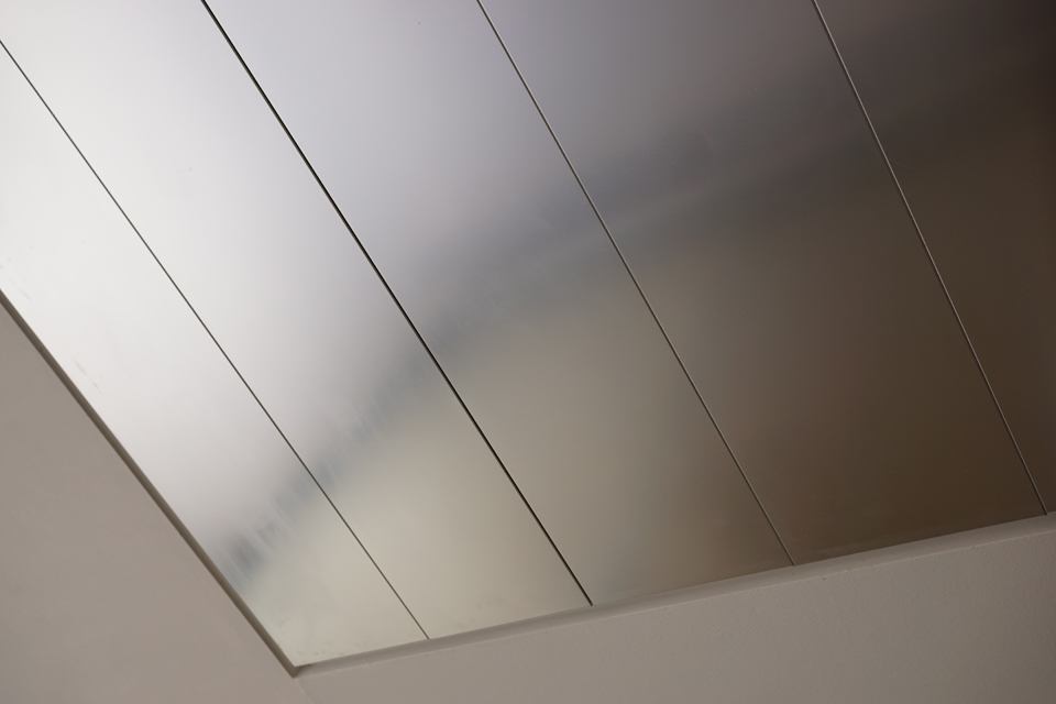
Now the first ‘element’ that comes to mind when we talk about photography is light. Here’s what I found when I tried to work my way from this starting point.
→ Here is an article on Minimalism I read after writing these lines. It is in German – but it seems to confirm some of my thoughts (for example, about materiality), so I thought I’d link to it for those of my readers who speak German.
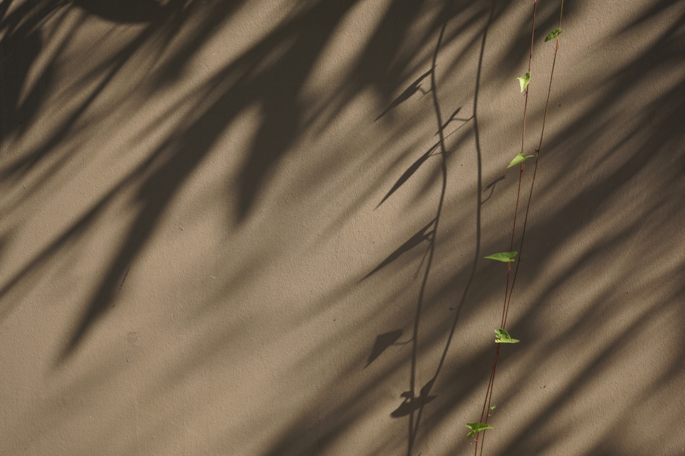
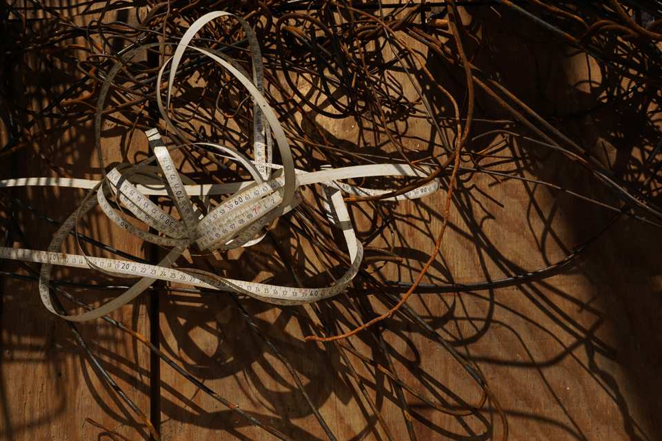
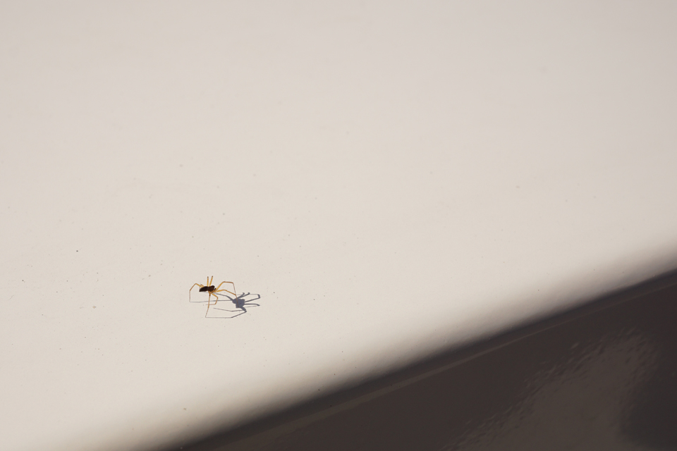
So much sun, so many shadows – for Paula’s Thursday Special. I did not really know which one to pick. The second picture is entitled Measure for Measure, and the third one seems to answer to Paula’s question: “Are you ready to face your own shadow?” Or will it make you trip over your own legs?
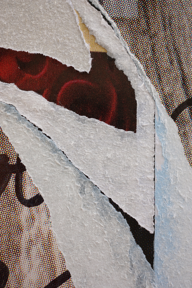
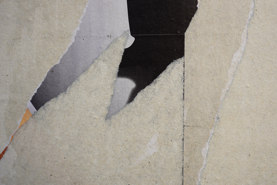
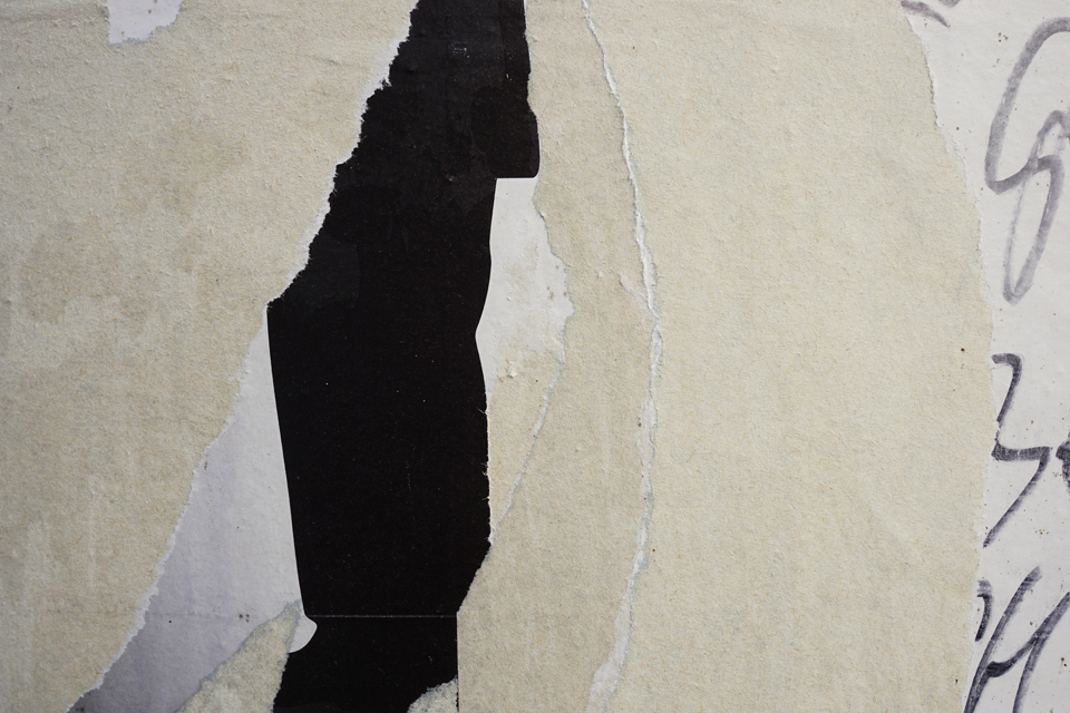
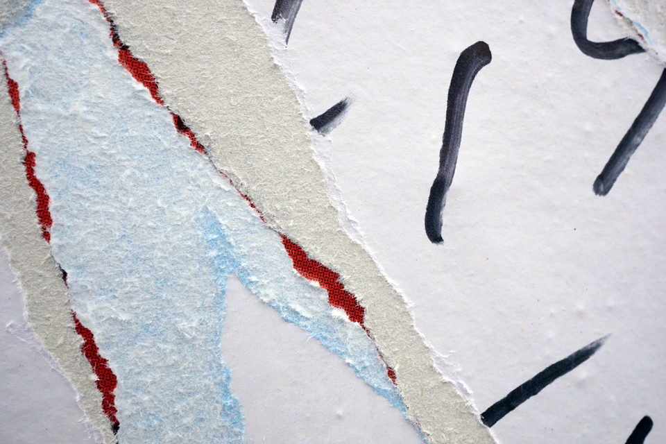
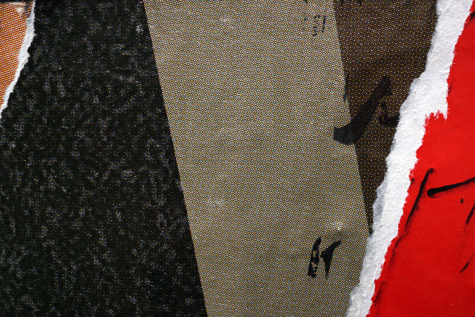
Litfaß: These pictures are important to me. About a year ago, I was looking for opportunities to focus on composition without paying too much attention to subject.
In this search I found Litfaßsäulen, advertising columns. On these columns, they attach one poster on top of the other. It’s standard procedure here in Germany, so if you look closely your realize the columns grow in diameter.
But there’s a local specialty in Wiesbaden: Somebody writes over the brighter parts of the posters, leaving quotes from the Bible, sometimes advertising his ability as an exorcist. Later, someone apparently not liking these particular graffiti tries to tear off the poster pieces that have been written on. And then the ‘work’ of the writer and his (alleged) adversary may be covered with a new advertisement the next day.
This is what we are looking at in the pictures: They represent a ‘slice of time.’
Still, I am asking myself why I don’t create palimpsests from old books or magazines or travel brochures? They could look very much the same as these photos with one difference: The palimpsest would feel like first-hand reality (as opposed to only a representation of a first-hand reality).
Would that really be better? The photos enlarge the paper’s structure as well as the dots and details that come with the printing process of the poster, and fragments of handwriting. I feel like I am at the ‘inside’ of the posters.
I realize that part of these photographs’ fascination lies in view of this materiality – graffiti pictures showing similar compositions do not do the job as well; I tried it: They always fall a bit short of my expectations.
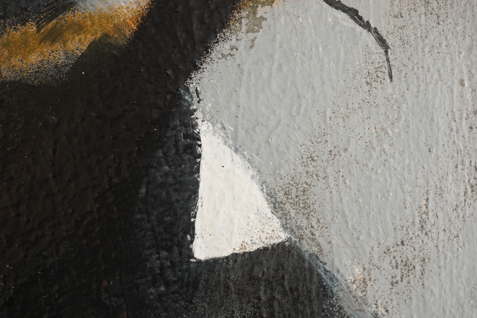
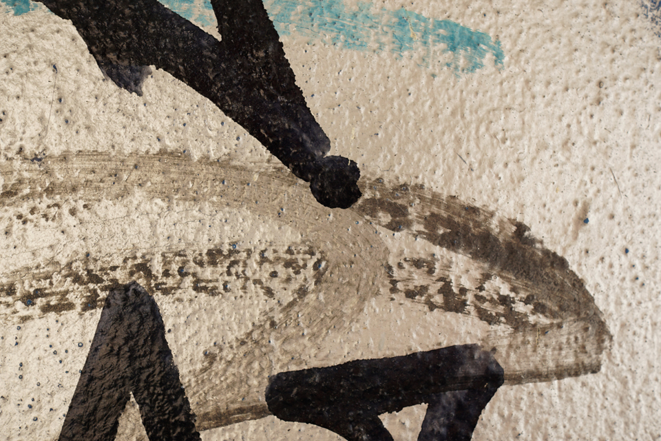

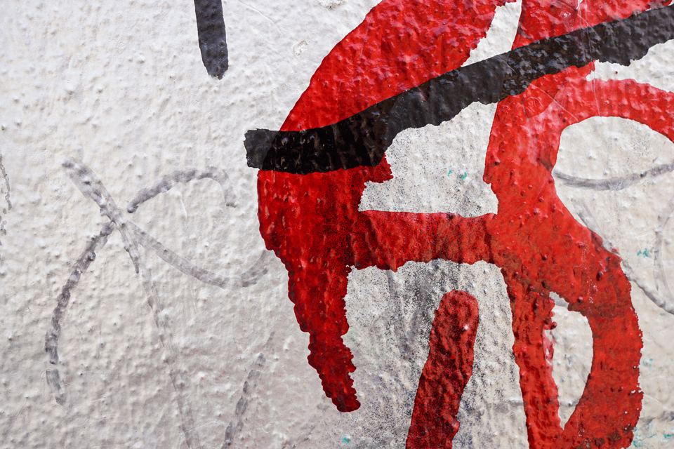
Photographing Graffiti: trying to turn pictures into pictures. The walls of Blankenese Lighthouse (Hamburg) were covered with layers of graffiti (‘gone over’). Framing parts of them into new pictures seemed to make sense … trying to bring to light whatever meaning the details might contain. [Jen, thanks for the Weekly Photo Challenge.]
My contribution for the Weekly Photo Challenge…


Paula would like to see Here and There wich immediately made me think of these pictures. I am trying to figure out the role photographs play in urban environments. Do we still notice them? Shouldn’t their realism, presenting ‘other space’ in urban settings, irritate? Maybe this only becomes visible once you photograph the photographs…
 This the fifth and last post in which I share pictures inspired by Paleica’s Magic Mottos. Formen und Figuren were in focus (no translation needed here, I think). Paleica mentioned geometrical forms among other things, which triggered it for me: I hope my contributions show that once you found a good topic, the pictures seem to multiply on their own account: You only have to know what you are looking for.
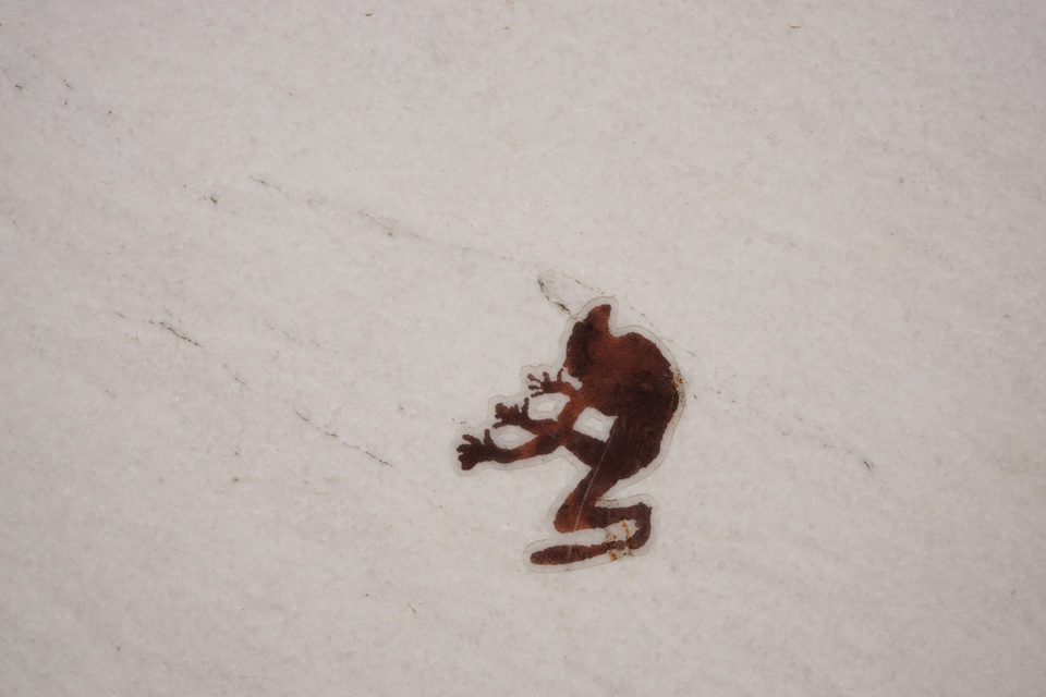
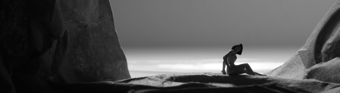
…or maybe it’s the God of Small Things. However, I did notintend to participate in Paula’s Thursday Challenge until I found this little devil, a very minuscule example of Urban Art.
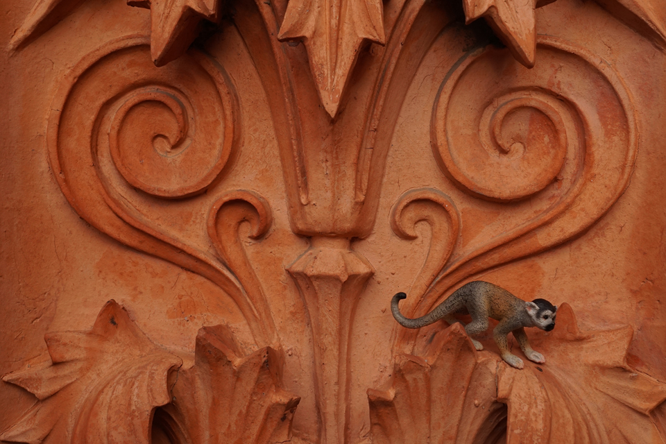 An entry for the Weekly Photo Challenge. For more experimenting and toying around with small animals in a life size world, see here.


Paleica at episoden.film gives photographers a month to come up with responses to her challenges, which is nice to begin with. In January and February I used the time to photograph and select, and came up with a retrospective by the end of the month. Today I see it differently. I photographed Formen & Figuren (shapes and figures), trying things out. I intend to share them over the month so we can see what develops (if anything develops at all).

Same scene, different pictures, and I do not know which one I prefer. So I decided to show them both, trying to prove the point that – as has been noted – that it is the difference that makes the difference: Both appeal to me, but for different reasons.
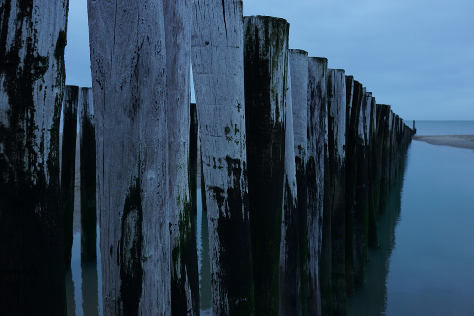
I looked at the original picture (bottom) and asked myself if it would look more ‘radical’ if I cropped the black parts to the left and right, letting the ocean view running past the margins of the picture. Now that seems to make the picture more difficult. There seems to be some hint that the world continues beyond the frame of the picture, and in some way the picture seems to correspond with its surroundings – the white background of the page – more openly.
In comparison, the original picture might be more conventional. The bright parts can be seen as a picture within the picture, and it is almost neatly framed – almost: The left part of the frame shows a post, its shapes are just visible. And the left side of the frame is also a bit “heavier” than its counterpart. It seems like this picture offers more information it is possibly more restful, suggesting that what we see is a whole complete in itself. It might be more affirmative.
Writing this, I realize there is a bias – but I really wanted to say that these are not just two more or less identical pictures of a piece of ocean, seen through some posts, but that form makes quite a difference, not necessarily between ‘good’ and ‘bad’ one, but in content.

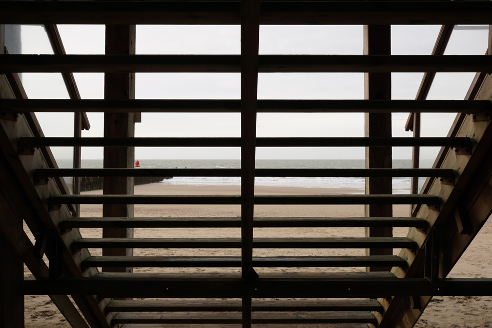


Near Westkapelle, Walcheren, January 2016.